
views
- Use classic colors like white, grays, browns, or black to get your desired level of contrast without making your grout compete for attention with your other decor.
- Make a bold statement with colored grout. Use greens, reds, blues, oranges, neons, or even glitter to accentuate your tile pattern and add unique character.
- Consider grout colors that compliment the surrounding decor. Go light if you want your tiles to blend together, or go dark to make the tiles pop.
Traditional Colors

Match white grout with white tile for a seamless, monochromatic look. If you don’t want your tile or grout to stand out, match shades of white to make the lines between tiles virtually disappear. This can help small rooms like bathrooms appear larger and allows other decorative elements in the room to pop. Consider three-dimensional or textured tiles to emphasize your tiles while maintaining a monochromatic color scheme. It's also a good idea to match the grout color to the color of your fixtures and finishes in the room.

Use black grout for a classic, high-contrast look. Choose black to highlight the shape of your tiles or grout pattern and make a bold statement. This contrast works especially well with white subway tile—the black grout evokes the original subway look while staying sleek and modern. The high contrast makes the grout and tile the main focus of the room and might make smaller spaces seem a bit busy.

Try a neutral light gray grout to get more contrast than with white. Light gray won’t speak as loud as black, but adds more definition and interest to your walls or floors than white grout. It’s also one of the easiest colors to keep looking clean, has a refined aesthetic, and won’t clash with other colors when you’re decorating a room. Light gray has a soft, pleasant feel that can make a room seem fresh and bright. Choose a light gray with warm undertones (yellow, red, brown) for bright and warm decor, or one with cool undertones (blue, purple) for darker, cooler decor.

Use a dark gray grout to get subtler contrast than with black grout. Try dark gray if you’re concerned black will steal too much focus. Like light gray, it’ll give the room some visual interest without clashing with other decor and is a low-maintenance shade to keep clean. Darker grays appear cooler than light grays and work great with room colors like blues, purples, whites, and greens.

Choose brown grout to add a warm, subtle contrast to your white tiles. Almost any shade of brown works with white—try a light tan or almond for a comforting, cozy look or darker shades like russet or chocolate to make a bigger statement. The warmth of brown can help balance out the sometimes austere lok of white walls, floors, or backsplashes. Brown works great in high-traffic areas like hallways or bathrooms since it’s easier to maintain than white or black.
Bolder Colors

Choose a shade of green to create a striking look with a relaxing vibe. Go for a bright, light green grout like lime to create a refreshing, modern look, or turn to darker shades like forest green to add more depth between the tiles. Green will stand out against white no matter which shade you choose, so opt for one that ties in with your other decor in the room. Green is a fun color to use because there’s a shade of green for just about any room or circumstance. The possibilities are endless!

Go with red grout for a warm and attention-grabbing accent color. Choose rich, warm reds to offset the shiny neutrality of white tiles in a unique way. Use a darker red, like maroon or crimson, to create a large contrast with the tile and highlight the tile shape or grout pattern, or go lighter to make less bold of an accent. Super bright, fire truck reds will help light up the room and make the space feel more playful.

Try blue grout for a coastal, quirky feel. Use blue with simple penny or subway tiles to create a calm, soothing atmosphere reminiscent of a beach town. Choose dark blues like navy or royal blue for high-contrast looks, or try lighter shades like teal or turquoise for a cheery, bold grout that isn’t overwhelming. Blue is a popular color in room decor, so blue grout can help tie a room together in a subtle way if you have blue artwork, furniture, or other decorations.

Choose a warm orange grout for a fun, unique look. Oranges aren’t as dark or bold as reds, so go orange to make a statement without the “look at me” energy of red. For example, a burnt orange can highlight the pattern of the tile and make your walls look almost like wallpaper since the grout color isn’t as deep. Try spacing your tiles slightly further apart to let this unique color pop. Warm orange grout is rarely overwhelming unless it clashes with the room’s decor.

Create an energetic, playful space with yellows, hot pink, or neons. Try a refreshing sunshine yellow to brighten up a room and tie tiles of multiple sizes together, or an eye-catching hot pink to add upbeat energy to your white, neutral tiles. Colors like electric blue, bright orange, or acid green have a similar effect. Bright colors and neons can get overwhelming fast, so use thin strips of grout between simple-shaped tiles like squares or rectangular subway tiles.
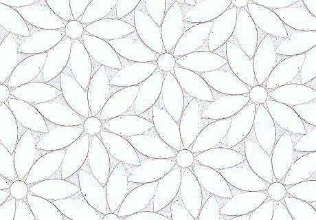
Get funky and chic with glitter or metallic grout. If you have uniquely shaped or textured tiles like flower petals or mosaic pieces that need ample space between them to create a design, consider grouting the backdrop in glittery gold or silver to showcase the design. Match metallic grout to the gold, copper, silver, or brass fixtures in the room for a refined, modern aesthetic. Metallic grout doesn’t pop as much as glitter or colored grout, so use it in rooms with muted colors where it won’t have to compete for visual attention. Glitter and metal grout can reflect some light onto your white tiles to add more color, dimension, and visual interest to the room.
Other Design Considerations
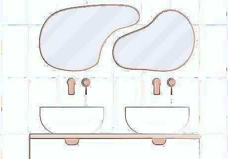
Select a grout color that compliments the surrounding decor. Consider the other colors, styles, and accent pieces in your kitchen or bathroom. If they’re fairly bold and bright and you want them to be the focus, lay a grout that’s near neutral and somewhat light to avoid competing areas of interest. If the room seems too simple or you need a specific color to tie together various pieces, consider a grout that’s darker and boldly colored to make a statement. Grouts with cool undertones (blue, purple) look “icy” compared to warm-colored decor, while warm undertones (red, brown) look redder compared to cool decor.

Choose dark colored grout for less maintenance and cleaning. White, beige, and light gray grouts are more prone to discoloration and require more cleaning and upkeep to keep them looking fresh. Darker colors, like brown, dark gray, or navy look cleaner for longer and don’t need to be washed as often. Black grout is more likely to fade or look dirty than other dark shades and usually needs more upkeep.
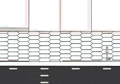
Use light grout to subdue your tiles or dark grout to make them pop. If you have a modern space or a room with a dramatic design element somewhere, choose a light-colored or matching white grout to put your tiles in the background. If you’ve got uniquely shaped tiles and want the grout pattern to stand out, go for a darker, contrasting color. Matching grout and tile can also help small spaces look bigger or more open. Highly contrasting grout works best if the dominant colors in your decor are black and white, or if you need to add a specific color to tie a room together.

Space tiles closely to mute your grout or far apart to highlight it. Choose white or a light, neutral shade of grout and install your tiles close together to make the grout almost disappear. Alternatively, opt for a darker, contrasting color and install your tiles a bit farther apart for a super bold look. Contrasting grout with closely-spaced tiles will still show, but won’t take center focus in the design of the room like thicker grout lines will. There's no standard spacing for tiles according to the Tile Council of North America (TCNA). The width depends on your preference and the cut of the tiles.



Comments
0 comment