views
New York: I've seen Android phones get better and more powerful over the years, as Google and phone manufacturers pack devices with more and more features. There comes a time, though, when less is more. I'm afraid we've reached that time.
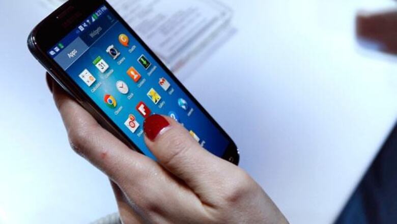
Samsung's new Galaxy S4 smartphone is an excellent device from a hardware standpoint. Measuring 5 inches diagonally, the screen is slightly larger than that on its predecessor, the Galaxy S III. Yet the S4 is a tad lighter and smaller overall. The S4's display is also much sharper, at 441 pixels per inch compared with 272 on the S III. The S4 has one of the sharpest screens out there.
The Android operating system it runs is excellent, too, and in recent years the Google-made system has become a healthy competitor to Apple's iOS system for iPhones. Like most Android phones, the S4 comes with a suite of useful Google apps, including Gmail, YouTube, Google Maps and the voice assistant Google Now. Because Google lets device makers customise Android to suit their needs, Samsung and others have been adding their own distinguishing features.
And that's the source of the problem. Packed with bags of tricks, phones have become way too complicated for many people to use. In some cases it's because these custom features work only some of the time. In other cases, you're confronted with too many ways to do similar things.
As much as Apple can be criticised for exerting control over what goes on its iPhones, it wins on simplicity. There are no competing agendas - just Apple's.
By contrast, Android has turned into a free-for-all. For instance, the Sprint version of the S4 phone has at least four different ways to watch video - one that comes standard with Android, one added by Sprint and two added by Samsung. Some content works with one but not the others.
And to watch video on one of the Samsung apps, the one called Samsung Hub, you have to navigate through two screens trying to sell you video that I couldn't get to work on the other apps. As much as it adds to the clutter, Samsung would rather you use its service and not the standard Android one. That way, Samsung rather than Google gets revenue from video sales. Samsung Electronics has its own app store, too, to rival Google's own Play store on the same device.
That doesn't mean you shouldn't consider buying the S4.
Another highly praised phone, HTC's One, has a lot of clutter as well. The display on the One is slightly smaller than S4's, but it has a higher resolution. The One sounds better, too, with front-facing speakers, while the S4 has a speaker on the back. The One might be the one for you if you watch a lot of video and listen to a lot of music. But the One feels heavier and bulkier, and its battery holds less charge than the S4.
Despite my complaints with all the add-ons on the S4, a number of them show promise:
Easy Mode: It's not entirely new, as the S III and the Galaxy Note 2 have it, too. But Samsung makes that option more prominent when people set up the S4 for the first time. Icons in Easy Mode are larger, so you are less likely to hit the wrong one and have to figure out how to go back. You also get fewer choices for customising the phone and using its camera, so there's less confusion about which to pick. Easy Mode isn't as easy to use as I would have liked, though, because features and settings from the regular mode creep in now and then.
Multi Window: Again, this feature isn't entirely new, but it's the first time I noticed it. It allows you to run two apps side by side, the way you've long been able to on traditional computers. That means I can keep up with Facebook on the top half of the screen, as I send email from the bottom half about all the dumb things my friends are saying on Facebook. Unfortunately, it works with a limited number of apps. Foursquare and Instagram aren't among them. And I needed an online video tutorial to figure it out.
Air View: When you point to an email or calendar entry with your finger, you see contents pop up in a bubble. That way, you don't have to open the entry and find the back button to return to what you were doing. Samsung has this feature on the Galaxy Note 2 phone, but that's designed for use with a stylus. On the S4, you simply hover over the entry with your finger. I wish it would work with more apps. For instance, you can use it with Android's generic email app, but you can't on the one made specifically for Gmail.
All of these would benefit from being part of Android rather than an add-on from Samsung. Easy Mode would truly be easy if it were designed from the start that way rather than as something that couldn't fully separate itself from the main Android. More apps would work with Multi Window and Air View if they were standard features, not ones app makers have to adapt for one by one.
And then there are some features that got in the way:
- I mentioned the competing ways to watch video and buy apps.
- Another is Smart Pause, which automatically pauses video when your look away from the screen. The phone's front camera detects your eyes. Smart, but the feature also pauses the video when you cover your eyes, say, to avoid a gory scene in a horror movie. It's as if the phone is forcing you to look. And there are few times my eyes are glued to video. I typically multitask and watch video while doing other things.
- Smart Scroll detects the tilt of your head or the phone to automatically scroll text, such as when you're reading a long article on a Web browser. Smart, but it sometimes scrolls past what I want to read. It's difficult to move the text back without touching the screen, something Smart Scroll is supposed to eliminate. And at times, I have to keep my neck up in an uncomfortable position to stop scrolling.
- With Air Gesture, you wave your hand over a sensor for such tasks as browsing a photo album or scrolling through text. I can see it being useful when you need to answer a call while driving (not that you should), but I had difficulty getting the phone to respond properly with photos and Web pages. It reminds me of automated water faucets that won't let me wash my hands no matter how much motion I make.
Fortunately, the phone comes with many of these features already turned off, and you can turn off others you don't need or want. It took me a while to figure out that the WiFi connection on my phone kept mysteriously turning on by itself because of some feature called Smart Mode. So Smart Mode is now off. Group Play is a feature that lets you share music and photos with other S4 users on the same WiFi network. But I don't know of any S4 users, and it doesn't work with Group Play on the S III. I couldn't uninstall the app, so I buried that in a new folder called Junk.
The S4 has plenty of other features I could dismiss. Some might like the camera's ability to erase a stray individual out of photos or to combine several images of motion into a single shot. But I'm a purist, and I'm not a fan of manipulating images. And the feature for using the phone as a TV remote control? That's what remote controls are for.
I shouldn't have to spend a lot of time customising the phone to turn off or hide what I don't want. Many people never change the default settings. I've been using the S III as my main phone since July, and I've rarely found a need to reach into its bag of tricks. I simply want a phone that is easy to use.
The S4 can be that, but first you must figure out how to hide all its gimmicks.


Comments
0 comment