views
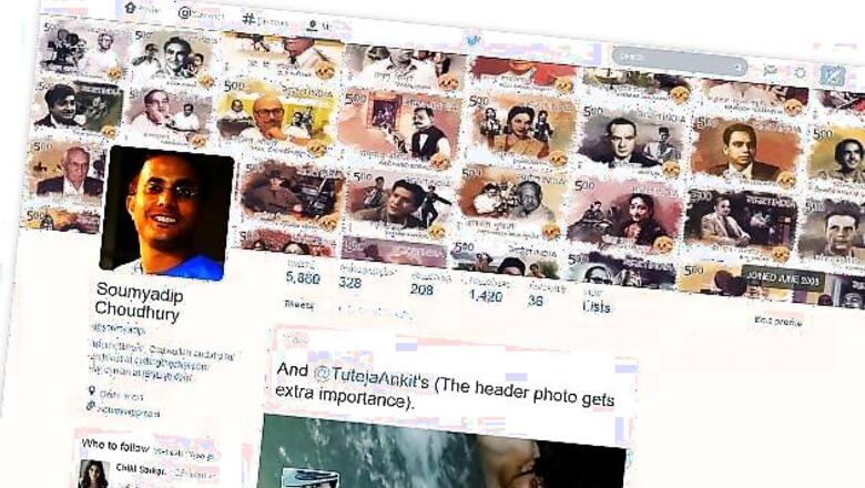
New Delhi: A few days ago Mashable assistant features editor Matt Petronzio spotted a major overhaul of his Twitter profile page and this morning it was my turn to be surprised with a super-sized Twitter profile.
I would have thought it to be some CSS error, if I wasn't already aware of something like this coming our way. Usually the one to welcome change, I wouldn't term this change as too much of a welcome one.
The new Twitter profile does display much more information than before but it does that in a design that appears to be made for screens much-much larger than my 1440px x 900px.
The profile banner, also referred to as the header photo or cover image is a huge 1500 px x 500 px and covers more than half of the display and the profile image overlaps it in a Facebook-like manner and the background image that I put in quite some effort in creating doesn't even show on my profile.
The background does display on my home timeline, but then it means that it is only for my own consumption and not for the world to see, defeating much of its purpose. Chances are, Twitter could also give our home timelines a massive facelift. We are already seeing signs of it.
There are also a lot of numbers on display, quite a lot more than before. The previous version of my profile displayed numbers only for tweets, following and followers but now Twitter has added figures for photos/videos and favourites and also added a link next to them to view lists that I have created, have subscribed to or are a part of. Now that lists acquire more prominence in your profile the problem is that because Twitter doesn't provide a one click way to remove yourself from unwanted lists (there are some workarounds though), there could be some possible embarrassments.
Interestingly, unlike the profile Matt Petronzio saw, mine is made of a single column of tweets and it is only under photos/videos that it goes multi-column, a form that looks much better to the eye.

The list of users you are following and those who are following you also now appear as a grid and also displays their header photos (but not how many followers they have. An important statistic to gauge importance on Twitter).

One interesting bit of information, that makes me now regret the decision of continuing to postpone signing up for Twitter when I first heard of it, is that the new design now highlights when you joined Twitter. One timestamp to stamp you as a veteran or a newbie. Something that is more permanent than all the other elements in your Twitter profile.

While others who haven't yet got the new profile design get to see the old version of my profile, I, when logged in, see theirs in the new format.

My biggest problem with the new Twitter profile redesign is that it is just too big. The font size of the text of the tweets displayed is 28px, double from the 14px it was before and therefore you get to see much less at once. This appears to be the in-thing in Web design, but I am old-school in this, gimme more at a go.


Comments
0 comment