
views
X
Research source
For example, you might make a line graph to show how an animal's growth rate varies over time, or how a city's average high temperature varies from month to month. You can also graph more than one data set on the same line graph, as long as it relates the same two variables. So how do you make a line graph? Just follow these steps below to find out.
Labeling the Graph

Draw a large cross in the middle of your graph paper. This represents the two axes y and x -- one vertical (going up-and-down), one horizontal (going left-and-right). The vertical axis is designated the Y-axis and the horizontal as the X-axis. The place where the lines cross is called the origin. The areas below the X-axis and to the left of the Y-axis represent negative numbers. If your data set doesn't include negative numbers, you can omit those portions of the graph.
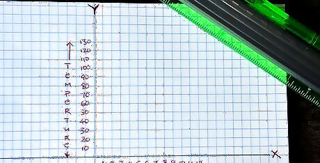
Label each axis with the variable it represents. To continue the temperature-time example from the introduction, you would label the x-axis as months during the year, and the y-axis as temperature.

Identify the range of data you have to include for each variable. To continue the temperature-time example, you'd select a range that was large enough to include the highest and lowest temperatures you plan to graph. If the range isn't very high, you can have a larger scale, spreading it out more so that it fills up the graph instead of just covering 10% of it.
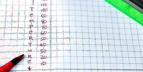
Decide how many units every line on the graph represents for each of your variables. You might designate a scale of 10 degrees Fahrenheit (12.22 degrees Celsius) per line to measure temperature along the Y-axis, and a scale of one month per line to measure time along the X-axis. Label several of the lines along each axis with the scale measurements. You don't need to label every line, but you should space the labeled line at regular intervals along the axis.
Plotting Your Data
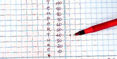
Plot your data on the graph. For example: If the high temperature in your hometown was 40 degrees Fahrenheit (4.44 degrees Celsius) in January, locate the "January" line on the X-axis and the "40 degrees" line on the Y-axis. Trace both lines to the point where they intersect. Place a dot on the intersection. Repeat for all of your other data until you've plotted each point on the graph. EXPERT TIP Joseph Meyer Joseph Meyer Math Teacher Joseph Meyer is a High School Math Teacher based in Pittsburgh, Pennsylvania. He is an educator at City Charter High School, where he has been teaching for over 7 years. Joseph is also the founder of Sandbox Math, an online learning community dedicated to helping students succeed in Algebra. His site is set apart by its focus on fostering genuine comprehension through step-by-step understanding (instead of just getting the correct final answer), enabling learners to identify and overcome misunderstandings and confidently take on any test they face. He received his MA in Physics from Case Western Reserve University and his BA in Physics from Baldwin Wallace University. Joseph Meyer Joseph Meyer Math Teacher Develop strong graphing skills. Drawing graphs by hand will help you develop foundational graphing skills, especially in understanding scales and axes. This will build a strong base for you to use helpful online tools to visualize complex relationships, perform calculations, and prepare for standardized tests.
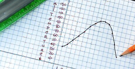
Connect the left-most dot and the dot to its right with a straight line. Continue connecting the dots, one by one, working from left to right. Make sure that it looks like you're connecting the points with straight lines only, so that the graph does not look curved. Once you've connected all of the points, you will have successfully graphed all of the data.

Repeat the process if you're graphing multiple data sets. If you're graphing multiple data sets on the graph, use a distinctive color of pen, or style of line, for the first data set. Place an example of the color/line style off to the side of the graph and label it with the name of the information being displayed. For example: "High Temperatures." Repeat steps 1 and 2 for the next data set, using a different-color pen or a different style of line for each data set. Place an example of the second line color/style in the margin and label it, too. For example, you could use a red pen to graph high temperatures, then use a blue pen to graph low temperatures over the same period on the same graph. Continue repeating steps 1 and 2 for each remaining data set you want to include on the graph.
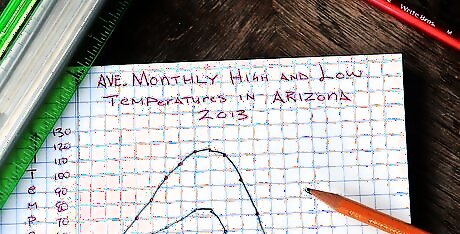
Write the graph's title at the top of the page. For example: Average Monthly High and Low Temperatures in Seattle, 2009. You should do this last after you know how much space all of the graphs will take up on the page.


Comments
0 comment