views
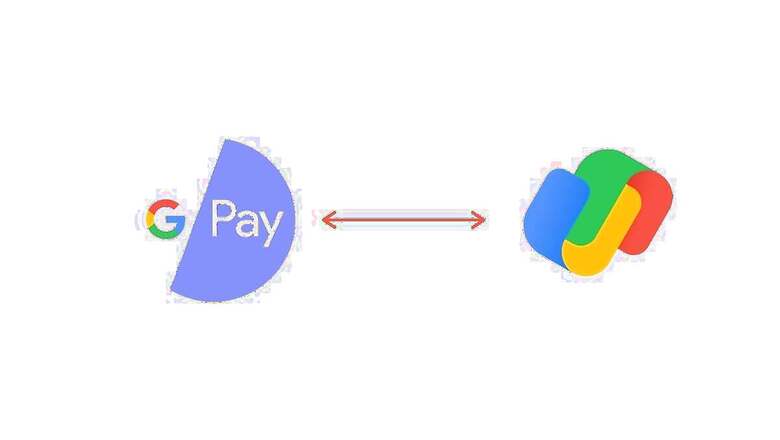
Few days ago, it was reported that Google is changing the logo for its payments app Google Pay after the new icon was spotted in the app’s latest beta update. The new Google Pay icon came at a time when Google is rebranding some other apps and tools in the Google Workspace like Gmail, Google Drive, Calendar, and more. The new Google Pay logo, as reported by beta testers, brings a three-dimensional look to the app icon, and people were having a hard time guessing as to what the new logo depicts. Now, a brief explanation from a Google executive has made things more clear.
Google’s Caesar Sengupta took to Twitter to explain that the two interlocking shapes on the new Google Pay icon are supposed to depict a wallet – something the Google Pay app has been trying to replace since the past few years. Some people had guessed correctly that the new Google Pay icon depicts a wallet. While this clears the air on the new logo, it is still not known as to why Google chose to bring in a new icon for its payments app. The icon also, despite clearly being that of a Google product, doesn’t indicate towards a payments app or a wallet in the first glance.
The new Google Pay logo was reported to be rolling out for beta testers in India. The icon was first spotted by a user on Twitter, who had found the new logo in the latest beta update for the Google Pay app on Android. The new Google Pay logo brings a three-dimensional look to the app icon, with interlocked U-shaped items that carry Google’s default colour palette.
Read all the Latest News, Breaking News and Coronavirus News here


Comments
0 comment