views
New York: I doubt I was alone in rolling my eyes when I first used Windows 8 a year ago. I found its touch controls and gestures awkward, and I was troubled by how little its primary, tile-based interface could do on its own.
For many basic tasks, I had to return to the system's traditional desktop mode, the one that resembles older versions of Windows. It felt as though I was working on two different computers at once.
Since then, I've warmed up to many of those touch controls and gestures, such that I've even tried to use them absentmindedly out of habit on my touch-less MacBook laptop. And the free Windows 8.1 update released Thursday addresses many of my remaining gripes.
Windows is still far from perfect. It continues to come across as a work in progress. But Windows 8.1 shows Microsoft is listening. People who already have Windows 8 will find digital life more pleasant with the update.
What was so bad about Windows 8's tile mode previously?
- I could open only 10 Web pages at a time in Internet Explorer and pages would automatically close once I had hit the limit, without any prompts or choice of which one. With Windows 8.1, there's no limit.
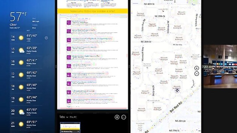
- The browser in Windows 8 didn't let me view more than one Web page at once. Sure, I could open 10 tabs, but I could see only one at a time. I couldn't leave a news site or Facebook open on one side of Window's new split screen for multitasking while I checked Gmail on another. With Windows 8.1, I can open a "new window" rather than a "new tab" using a right click to have a second page visible.
- That limitation also applied to Window 8's Mail app. With Windows 8.1, I can now have two messages open at once. And if I click on an attachment, it opens to the side rather than replace what I'm reading. The Mail app's layout adjusts to fit into the remaining space.
- I could access some computer settings from the tile-based interface, but Windows 8 sent me to the desktop for many others, including changing the display screen's resolution and controlling how quickly energy-saving measures kicked in. Now I can adjust that and more from the tile-based interface in Windows 8.1, though I still can't check the specific percentage of battery life I have left without going to the desktop.
Beyond fixes, Windows 8.1 offers these improvements:
- Universal search. With one search command, I can access files stored on my computer along with Web content on the Internet. Type in "Shakira," for instance, and I'm invited to hear her songs through Xbox Music or watch her videos on YouTube. I also get links to her biography, official website and Wikipedia entry. Type in "Toronto" and a map, suggested attractions and the current weather there will pop up. In both cases, I am also shown documents on my computer with those words in the text.
- New features. I can diagnose my medical condition by tapping on a body part on the screen and checking off symptoms. I can also keep track of my workouts, recipes and shopping lists. Another feature lets me save content from webpages and apps to read later offline.
- Customization. I can rearrange tiles and rename groups of apps more easily. With one swipe up from the home screen, I can see all my apps and arrange them by name, category, installation date or frequency of use.
- Old habits. I can set the computer to always boot up in the desktop mode, allowing me to minimize my interaction with the tile-based interface. That said, this seems like cheating, an admission that the tile mode isn't working, when Microsoft is banking its future on it.
That gets me to the things Windows 8.1 doesn't fix:
- It still feels like two separate computers at times. Each mode has its own Internet Explorer browser. Pages I have open in one won't automatically appear in the other. Many programs, including Microsoft's Office, work only in desktop. I can customize the background images so both modes match, but that's cosmetic.
- Although Windows 8.1 lets me adjust how much screen space each visible app takes, that slider only moves left to right. So with three or four apps open, all of the apps are vertical. That's awkward for video and word processing. And while Windows 8.1 doubles to four the number of apps I can have side by side, it was unlimited before Windows 8.
- There's no easy way to open apps without going to the full-page start screen. Before Windows 8, there was a Start button on the lower left corner to do that. The Start button has been restored in Windows 8.1, but its functionality has not. So if I have video playing, it stops as I switch from app to app or do one of those universal searches.
- The touch controls can still be confounding. Windows 8.1 comes with new gesture controls, such as the ability to accept word suggestions as you type by swiping and tapping the spacebar. Too often, I simply add unneeded spaces instead.
Microsoft's tile and touch approach will take time to get used to, even with Windows 8.1. That approach works fine on phones and tablets, but not necessarily on desktops and laptops.
I know change is inevitable. I eventually embraced Apple's Mac OS X, introduced in 2001, after more than a decade of growing up on what became known as Classic. But it took me until 2006 to fully switch. It's been only a year with the new Windows. I'm not ready to cede my Windows 7 and Mac computers quite yet.
If you're buying a new Windows computer or already have Windows 8, your choices are limited. In that case, you might as well accept Windows 8.1, which is far better than Windows 8.
About Windows 8.1
It's a free update for computers running Windows 8. Simply go to the online Windows Store to get it. Computers with Windows 8.1 already installed will go on sale Friday local time. That's also when you can buy stand-alone copies of Windows 8.1, if upgrading from Windows 7 or earlier.


Comments
0 comment